Your website may look great when viewed at a superficial level, its layout looking neat, its colours seem appropriate, and the content looks correct on first inspection; however, you will probably find visitors leaving your site very quickly without having any contact or completing any purchases. This is not an example of bad luck but is more likely attributable to the fact that your current design is counterproductive to what you want to achieve and is a sign of bad website design.
Many of the problems that website owners face are sometimes not obviously apparent and do not hit you in the face with a big, loud bang. They typically lay in the background, slowly suppressing your results – a slow-loading page here, an illegible menu there, and many other small issues throughout the site can be stacked up so that altogether your website has a sizable number of website design errors, causing it to lose visitors.
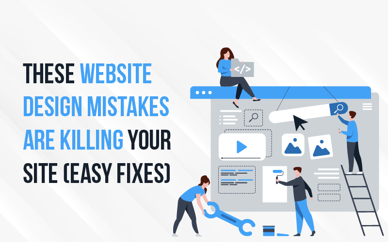
Generally speaking, these errors will become second nature to the website owner and won’t seem out of place to the new visitor. This blog breaks down some of the most prevalent website design mistakes, exposing your website to potential visitors, and gives you a series of easy fixes that you can apply without having to replace everything.
Why Website Design Mistakes Cost You Traffic, Leads, and Sales
People make quick decisions. Typically, just a few seconds after arriving on your website, visitors will judge it. If it feels to them like the website is having performance issues (i.e., it’s slow and/or all over the place), or it’s hard to navigate, they won’t give you another chance to convince them about your value proposition. Therefore, poor design or bad website design will cost you visitors without you ever knowing it.
A website with poor design is also a site that does not create trust. People will associate a website’s design with the quality of the business behind it. If the two don’t match, they will assume that the quality of the service will not match, and again, rightfully or wrongfully, that is how people think about things. Small mistakes in a website’s design add up to big web design mistakes, hurting conversions. Examples include: a confusing navigation menu; text that’s not easy to read; lack of a clear next step; and each of them takes away from the likelihood of the user taking an action. When combined, they create significant problems for conversion rates.
Fortunately, most of these issues are not that tough to fix. You do not have to create a brand-new website; you just need to identify what is getting in the way and clean up the website design mistakes.
Mistake #1 – Slow Page Load Speed

One mistake that many people do not understand the importance of is slow loading times on a website. This can be much more detrimental than most people think. While you may think that a couple of seconds will not matter, in reality they do. Each second that your visitors experience a delay gives them another reason to leave your site without taking any action. If users experience heavy or sluggish impressions, they are going to look for a faster alternative than waiting around to see what your page has to offer, at which point you lose an opportunity to convert a visitor. Additionally, speed problems indicate there are deeper website design errors with your site and therefore will have implications for both search and user experience.
Why Speed Matters More Than You Think
User patience is limited at best. When a page takes too long to load, the incidence of bounces will increase almost immediately. Therefore, slow loading time is a classic common website design mistake that forces users to abandon your web page before there is any opportunity to view your content. Additionally, slow load time has negative implications on your web site’s visibility on search engines and ultimately your company’s sales as such website design errors affect you negatively in two ways.
Easy Fixes for a Faster Website
Optimise images! Large files slow everything down. Eliminate any unused plugins from your website, as each of these adds weight and therefore contributes to slower load times. If no other option provides adequate improvement, then upgrade your hosting provider to one with better servers, as this will provide you with a significant benefit in terms of website design mistakes. Also, use basic speed tests to identify and fix website design errors as early as possible.
Mistake #2 – Poor Mobile Experience

Your website’s primary audience is likely to use mobile devices to access your website. If your website doesn’t provide a satisfactory experience for these users, you have a fundamental flaw in bad website design. Users who visit your site on a desktop computer may see a well-designed website; however, users who visit your site on a mobile device may not have that same experience. If your mobile website is poorly designed or unresponsive to mobile users’ needs, the likelihood of those users continuing to use your website is very low, making this a common website design mistake.
How Mobile Issues Drive Users Away
Mobile website users expect a seamless experience. When they encounter buttons that are difficult to tap or text that is so small that they have to zoom in and squint to read it, they will leave your website immediately. A majority of users visit websites using their mobile devices, so even small glitches in mobile design can be a significant cause of traffic loss and a clear example of bad website design.
Simple Mobile Design Fixes
Implement responsive design so that your website will automatically adjust for all devices; create buttons that users can easily tap with their thumbs; and utilise actual smartphones to conduct an audit of your website prior to allowing your audience access to it to identify inconsistencies or website design errors.
Mistake #3 – Confusing Navigation

When users have difficulty finding what they are trying to access, they leave. Confusing navigation is one of the biggest and most common website design mistakes, and it can diminish conversions without you even being aware that it’s occurring. An effective design allows users to navigate easily, without having to think about their next click. A user who finds a menu cluttered or with unclear layout will lose confidence and stop exploring your site. The confusion caused by certain design elements is a classic example of how website design mistakes impact conversions without your knowledge.
Signs Your Navigation Isn’t Working
Too many menu items can overwhelm the user. A vague menu label can make it difficult for users to understand what is available on the page. A user may click on several pages, go back and forth, before finding the desired page. When a visitor feels lost, the cause can often be traced back to navigation design trends for website designs that involve web design mistakes, hurting conversions.
How to Make Navigation Effortless
Use clear, familiar labels that identify and describe what is on the page. Have page items in a logical order. Remove options so the user is not forced to choose among too many choices. Using clearer labels for menu items and/or fewer menu items will help to fix many web design mistakes, hurting conversions.
Mistake #4 – Weak or Unclear Visual Hierarchy

If your web page doesn’t provide visual guidance to the eye, your audience will be unable to identify what to focus on. This is an example of a subtle yet destructive website design error: when everything is the same size, colour, or weight, nothing stands out; therefore, your users will skim over your key messaging and continue without engaging with your content. Although these website design mistakes do not appear broken, they make your content harder to interpret and more likely to be ignored.
Why Users Struggle to Scan Your Page
Users scan pages before reading. If all elements appear similar, scanning fails. There is no visual anchor to guide focus, so important content is skipped. This is a direct result of website design errors that are hiding your best messaging.
Fixing Visual Flow Without a Redesign
Break content with descriptive headings. Add white space between sections and position buttons where the eye naturally falls. Minor tweaks like these fix many website design mistakes without a full redesign.
Mistake #5 – Hard-to-Read Content

Bad website design is often characterised by difficulty in reading; visitors who struggle will not stay long. Strong copy fails if the layout works against it. Text that feels heavy or tiring is a common website design mistake that causes readers to skim, miss key points, and leave.
Design Choices That Hurt Readability
Small fonts strain the eyes. Low contrast makes text blend with the background. Long paragraphs feel overwhelming. These are classic indicators of bad website design, forcing readers to expend more effort than they want.
Quick Readability Improvements
Increase font size. Add line spacing and paragraph breaks. Shorter paragraphs make content easier to scan. These changes alleviate many common website design mistakes.
Mistake #6 – No Clear Call-to-Action (CTA)

You’ve done the hard part. The visitor is reading. Then they hit a wall. No direction. No next step. This is one of the worst website design mistakes, often causing users to leave without acting. Many web design mistakes hurting conversions happen here—not because the offer is poor, but because there’s no clear action.
Why Visitors Don’t Take Action
Too many CTAs confuse users. Weak wording has little impact. Poor placement hides buttons. These are classic web design mistakes hurting conversions.
CTAs That Actually Get Clicks
Focus on one primary action. Use clear, direct language. Make buttons visually distinct. Minor adjustments fix website design mistakes and turn attention into action.
Mistake #7 – Lack of Trust Signals

Trust drives decisions online. Sites missing trust indicators are examples of bad website design, quietly driving visitors away. Small credibility gaps become website design errors that cost conversions.
What Makes Users Hesitate
No testimonials, missing contact info, or outdated visuals create doubt. These website design errors make visitors pause and leave.
Easy Ways to Build Trust Fast
Add genuine testimonials and reviews. Display clear business details. Keep images up-to-date. These fixes resolve bad website design issues and restore visitor confidence.
How to Audit Your Website for These Mistakes
Catching website design errors early saves time and money.
- Use a checklist: page speed, mobile usability, navigation, readability, and CTA placement. Many common website design mistakes are easy to spot.
- Tools like Google PageSpeed Insights, Hotjar, or browser testing reveal hidden problems.
- Know when to call an expert to fix web design mistakes hurting conversions.
- Regular audits prevent small issues from becoming costly website design mistakes.
Final Thoughts
Most website design mistakes are common and practical to fix. Minor changes like improving speed, navigation, readability, or CTAs can dramatically increase traffic and conversions. Start today: audit your site, identify issues, and turn visitors into loyal customers.
Frequently Asked Questions
1. Why do visitors quit visiting my site after a couple of minutes when the website looks attractive?
Although your website has a good presentation, there may also be hidden usability problems. To determine whether your visitors are leaving quickly, you will need to look at access speed, navigation clarity, and mobile usage (among other factors), as they all greatly impact how long they stay or how quickly they leave.
2. How can I tell if my website is loading too slowly?
Using a variety of tools, including speed testers, can help you evaluate your site’s load time. If it takes longer than a few seconds for a page to fully load, you should either optimize the images on your site, remove any potentially unnecessary plugins, or switch to a hosting provider that can deliver faster loading times.
3. Why does my website perform poorly on mobile devices?
Your website may lack a fully responsive design. Therefore, every page should fit within the constraints of the different-sized screens. You’ll also want to make sure that all text is legible and that any buttons are designed for touch interaction so that your users can have an enjoyable mobile experience.
4. How do I improve my website navigation without redesigning everything?
You will want to simplify your menu, use more meaningful labels, and create a more logical page hierarchy to help users find the information they need quickly. Improving your site’s overall experience using the above suggestions will boost user engagement without requiring a full site redesign.
5. Why aren’t visitors taking action on my website?
One reason could be because there are not enough calls-to-action (CTAs) or they are unclear/weak. Each web page should have a main action for visitors to follow, using straightforward language and buttons that stand out from other page elements to clearly indicate what they need to do next.