Have you ever been analyzing your website’s traffic and said, okay… people are arriving at my site. Why aren’t they doing anything? You try changing your headlines. You change how your call-to-action message looks. Maybe you blame the source of traffic. In most cases, the problem is not with what you say, but with how people arrive at your website: tired, distracted, and just a little bit skeptical.
Web design with conversion in mind is not just about good-looking websites. It’s about getting rid of the friction you didn’t even know was there.
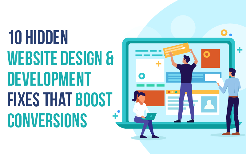
Easy Website Design & Development Fixes to Boost Conversions
Below are ten simple changes that can dramatically increase your website’s conversion rate without starting over or tearing everything up.
#1: Your Homepage Is Asking Too Much, Too Fast

Many homepages try to explain all aspects of what they offer on the first slide.
However, first-time visitors do not need to see everything. Instead, all they are looking for are three pieces of information:
- What do you sell?
- Am I eligible to purchase your product?
- What should I do next?
The easiest way to improve your home page is to offer only one clear call to action above the fold, and avoid multiple calls to action or various messages.
To increase your website conversions, select the next step, rather than the entire journey.
#2: Your Primary CTA Blends In

If your primary CTA matches the other design accent colors, it won’t be visible.
This happens all the time on even the most “well-designed” websites.
Conversion-oriented website design treats CTAs like street signs, not ornaments.
They should look like a bright, neon sign. Obvious. Somewhat unavoidable. Even mundane.
Quick test: Squint at the page.
If your CTA doesn’t stand out, neither will any conversions.
#3: Page Speed Is Quietly Killing Trust

It can be awkward to read through techno-jargon (and sometimes we don’t want to). The one-second delay you’re about to learn about is actually going to decrease your conversions significantly. Not just “in theory,” but actually!
Slow sites are caused by large images, unoptimized scripts, and overly complex animations that are served after the user has lost patience. If you’re serious about development tips that will really help you out, this is where you need to start. Site speed is not only important for SEO but also for users assessing your website’s legitimacy.
Slow websites signal a risk when doing business with a company, even if the company is not a risk.
#4: Your Forms Feel Like Homework

Additional fields in a form provide further reasons to abandon a form submission.
Name. Email. That’s it.
The only information you should request is the contact name and email address; anything else, such as company size or budget, should be addressed in a later communication with potential customers.
Excellent website design that generates conversions respects momentum, so start building a relationship with your customer before you begin asking questions.
#5: Mobile Isn’t “Optimized”, It’s Just Smaller

Many websites work great on all devices, but some have a terrible mobile experience:
1. Buttons are placed too close together
2. Blocks of text are too lengthy
3. Popups block the screen and your thumb
If you are receiving a majority of your traffic from mobile devices (your numbers suggest so), your site’s ability to convert may hinge on mobile usability.
Optimize your website for mobile-first (rather than desktop).
#6: Your Headlines Are Clear, But Do Not Connect

Besides clarity, comfort causes conversions.
Too often, founders have clear headlines for their products but don’t account for visitors’ doubt and hesitation.
Try switching things around a bit. Instead of just stating what you do, state why the visitor is there.
This slight emotional shift reduces resistance to converting.
Resistance is what kills conversions.
#7: You’re Hiding Social Proof Where No One Sees It

Testimonials placed at the bottom of a web page are not effective.
Potential customers look for trust signals before they make a purchase, not after scrolling down for 90 seconds.
A little secret about web design is to place your trust signals at the moments when your customer is making a decision.
Place them near your pricing, CTAs, and forms.
That is how trust is built.
#8: Your Navigation Gives Too Many Escape Routes

Having 8-10 navigation links in your main navigation seems like a good idea; however, is it really?
Too many choices make the visitor’s decision difficult; they may roam without making a decision, or, worse, leave.
A conversion-oriented web design does the opposite; it takes off some of the unnecessary exits (for example, high-intent pages like landing pages for signups, demo requests, and purchases) and allows the user to maintain momentum when the page was intended for that purpose.
Using a purposefully designed webpage provides the visitor with a single, explicit action. There is no pressure or trickery involved here – just less distraction means an easier decision will lead to a higher conversion rate.
#9: Microcopy Is Either Missing or Too Polished
A single “Submit” label on a button lacks warmth and makes people feel uneasy, even threatened.
Having a few words in the form of human speech can decrease anxiety when making a decision to click. For example, phrases like “no credit card required” or “take less than 60 seconds” reduce anxiety when making that decision.
Most web optimizations are overlooked as too small to matter until you test them.
Once you do, you will see an increase in conversion rates and less hesitation, and you will ask yourself why you didn’t do this sooner.
#10: Your Site Explains Features Before Outcomes
Feature-heavy designs are often appealing to founders, but users focus on other factors first.
Outcomes are the primary focus for users, outcomes like “less stress”, “time saved”, “more convenience”, etc.
Many top converting web design ideas utilize flipping this format around:
First, present “outcome” → then present “the relevant feature”.
First, present “problem” → then present “the relevant solution”.
Changing how these two framing structures are presented can increase customer engagement, even if the product remains unchanged.
Final Thoughts: Don’t Redesign. Pay Attention.
This is the plain truth.
Most websites do not require a complete redesign. They just need a clearer understanding of the way actual human users interact with them. You can improve conversions by observing rather than inferring. By watching for where visitors hesitate. By watching for places they leave by being aware of the times that they come close to clicking – but do not.
These are the valuable moments!
Fix them every time. Not everything each time, but one.
If you’re looking for a practical action step that you can carry out this week, select one of the issues above and fix it by the end of the week. Measure the impact on your conversion rate. This is how progress builds.
This is also how to develop effective, conversion-driven websites. Not with significant changes, but with deliberate, focused improvements!

